Host mode: phase 1
Using mixed method research, brainstorms, and sacrificial design concepts to uncover new insights about hosts and pave the way for a more intuitively organized app for hosts and guests.
Product design > Turo case studies > Host mode phase 1

Synopsis
Myself and the small but mighty host design team paired up with our researcher to test sacrificial designs on how we might improve host workflows with better information architecture.
Team: Host design (3 designers, 1 director, 1 researcher)
Platforms: IOS only
Role: Lead Product Designer
Skils: UX/UI, information architecture, content strategy, wireframing, prototyping, usability testing, research synthesis, mentoring and leading
This is a multi-phased project that spanned over 3 years
Timeline for phase 1 was 2 months

Problem definition
The app was not intuitively organized to help hosts manage their business

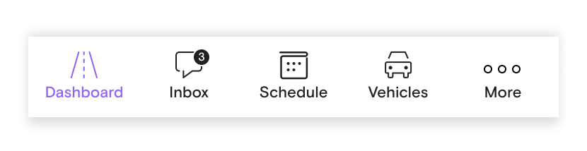
Existing nav bar
It’s a hassle to manage listings on Turo
It takes at least 5 taps to edit one setting for one car.

It’s a hassle for hosts and guests to manage trips
Guests find it challenging to find core actions in trip details.
Hosts must drill down far to take high frequency actions such as approving a trip modification, recording the vehicle before check in, or requesting reimbursements.
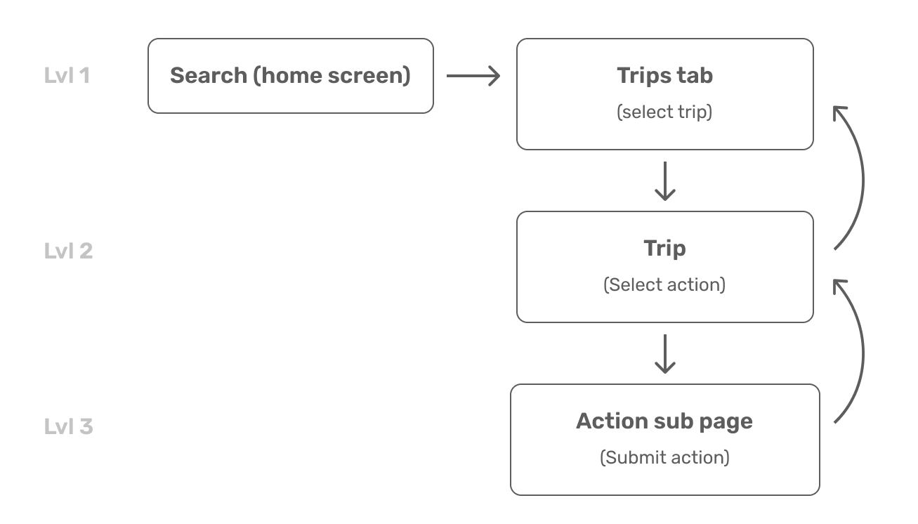
As a host becomes more successful and scales their fleet, this hassle multiplies
Shared UI is not optimized for host and guest
Example: Trips tab
Activity feed is a fire hose of notifications and isn’t contextual to individual trips
Booked trips are divided into starting and ending legs, which is confusing and un-useful for guests
Trip details displays both trips as a guest and a host in the same list with very little differentiation.

The app has no sense of modality
When a host launches the app, they see search, which is not relevant.
When a guest on a trip launches the app, they still see search and value proposition information

Most of our guests never want to become hosts, so why waste this valuable real estate?
There were aspirations from the guest team to replace “host” tab with favorites, but they never could because there would not be a place for hosts to access their settings and views.

Design problem
What would the app look like if it were optimized for a host’s work flow?
Goals
Influence the roadmap
Come to roadmap planning with a tangible prototype to show and not tell our ideas in order to influence the 2020 roadmap
Define the vision
Develop a cohesive vision for how all our ideas could fit together.
Improve the experience
Design an experience that increases ease of use, better supports host high frequency tasks, and optimizes earnings.
Research
We had many questions…
Information Architecture
What are the most common highest frequency tasks hosts have and how would that dictate our primary navigation?
Where does a host naturally think to access trip details/notifications?
Which features, information, and tasks would hosts naturally group together.
Features
What would a host home screen look like?
How can a host-level schedule or bulk apply features help fleet owners
Card sorting
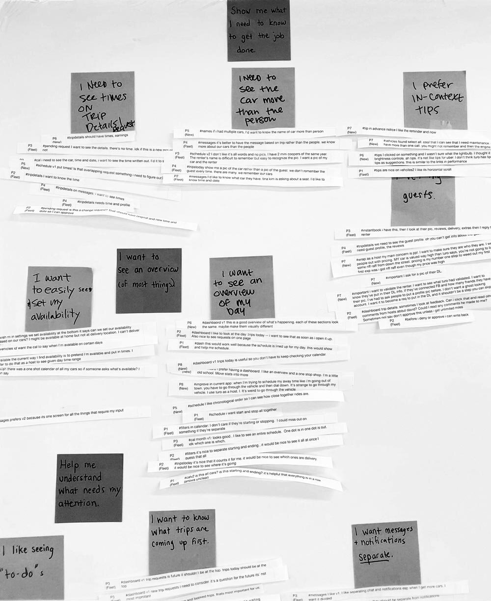
To uncover the information architecture questions, our researcher conducted a remote card-sorting activity. We gave hosts 50 settings and actions and asked them to group them together and name the groups in ways that made sense to them.
Findings:
We were glad to see that some of the early ideas we had around how we might organize the app navigation for a “host mode” were backed up by how hosts were thinking about their workflow.

Artifact from the card sorting research. Credit Ansaria Mohammed for spearheading this research
We leveraged ideas from previous brainstorms
At the beginning of the year, we had conducted a multi-team brainstorm with our product management peers to generate candidates for our team roadmaps. We went back to the boards for inspiration and pulled some of these themes we were unable to prioritize:
Provide a more usable “day at a glance” view for hosts to manage trips across all their cars.
Improve messaging to better facilitate communication with guests, which would lead to more 5-star experiences.
Allow hosts to bulk apply certain settings to their fleets to reduce repetitive actions.
Add educational tips and status reminders to help hosts manage their cars
Keep hosts coming back with relative rankings

Competitive analysis
The team compiled a digital catalog of competitor apps with similar peer-to-peer models. We audited the host-centric experiences and looked for patterns in the main navigation hierarchy.
We also pulled visual inspiration from dribbble.

A small snippet of the large competitive analysis doc we created

Visual inspiration for Dashboards from various artists on Dribbble
Crazy 8 sketches
During host design team meetings, we held crazy 8 exercises to generate a lot of ideas quickly.


Wireframes
We digitized the crazy 8 sketches and brought them to our next meeting to discuss.

Nailing the primary navigation
Re-designing the entire app to accommodate a host’s work flow covered so much surface area. We decided early on that we would focus on high level information architecture and show the most important features and work flows for hosts.
We discovered that there were promising ideas with two different tab directions.
Option one
The first direction leveraged a host Dashboard, that would have a high-level view of their business. It would serve as a way to deep link into areas that required attention, such as new booking notifications, claim statuses, etc.

Option two
The second direction prioritized two high-frequency tasks for hosts, speaking to guests (inbox) and planning their schedule.
Divvying up the work
Each designer took one tab and explored multiple concepts for each of these tab structures.
I explored the concept of the Dashboard and the stats page
Helen Li took messaging
Michael Noh explored a host-level calendar
Matt Fukuda pitched in on vehicles
More brainstorms
It was at this point that we felt we we could now dive deep into our respective areas. Each designer lead a brainstorm using different methodologies. It was really interesting to see the types of outcomes of each methodology. We certainly learned from each other during this rapid ideation phase.

Michael lead a writing exercise and coded responses, Helen led a priorities matrix, and I lead a sticky brainstorm
Design audit
By changing our tab structure, I was tasked with fitting a lot of high level information into one new tab.
Performance tab
Earnings tab
Calendar / Trips
Host Dashboard concepts
I realized pretty quickly just how much stuff we had to pack into the dashboard.
I knew I had to pack a lot into the dashboard, so after synthesizing the ideas from the sticky brainstorm, I came up with a system for different modular sections.
I also explored horizontal scrolling as a means to add more content in the same section. I took a lot of inspiration from the Clarity Money app.
Concept one: Day at a glance view
We highlighted high frequency tasks, important statuses, education and tips to become a better host, and the host’s earnings.
In this concept, I prioritized the most immediate actions and statuses toward the top and gradually the modules became less and less immediate.
I explored multiple modules of “most recent” activity that could deep link the host deeper into the product.
Concept two: Performance oriented view
This concept prioritizes some of the performance metrics that Turo cares about and adds more business performance metrics hosts care about, such as a trip fulfillment funnel, earnings, and their fleet’s utilization rate.

A simplified and truncated view of Day at a glance concept
Concept three: Act, Monitor, Learn view
We tried breaking up some of the concepts from the previous two ideas and organized them in tabs. I continued to rev on this idea, as it gave me more opportunities to organize information and make things easier to find. We decided to remove the tips tab and focuse on “today” and “performance.

So many more iterations…
In all these explorations, I was searching for the perfect balance between showing high level information and then allowing a host to drill in to see more, either to a new page, a modal, or a bottom sheet view.
Prototyping and testing
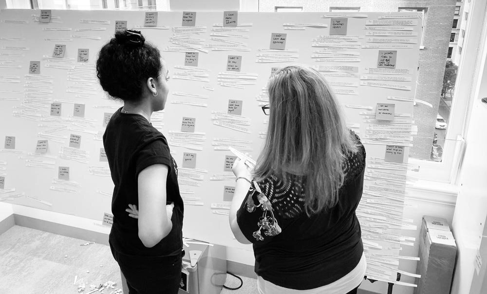
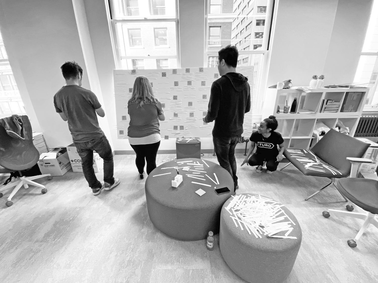
Each designer had two final prototypes to match the two navigation concepts. Our research lead held remote interviews and usability testing with new hosts who had 2-9 trips and fleet hosts with 5-19 trips.
Insight Synthesis
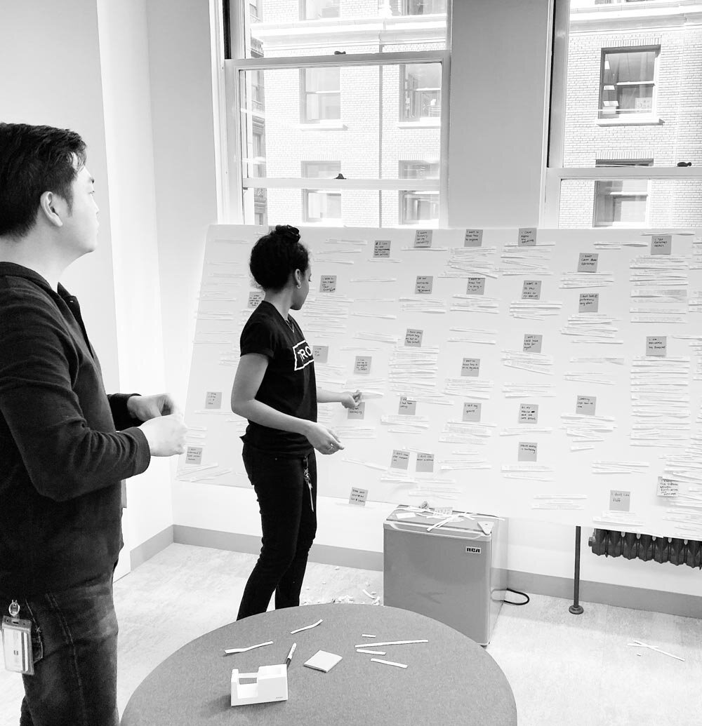
Because we had such a large surface area to cover by testing 8 different prototypes, we uncovered so many insights that the team pitched in to synthesize the data. Ansaria led an affinity diagram exercise that took 2 days.
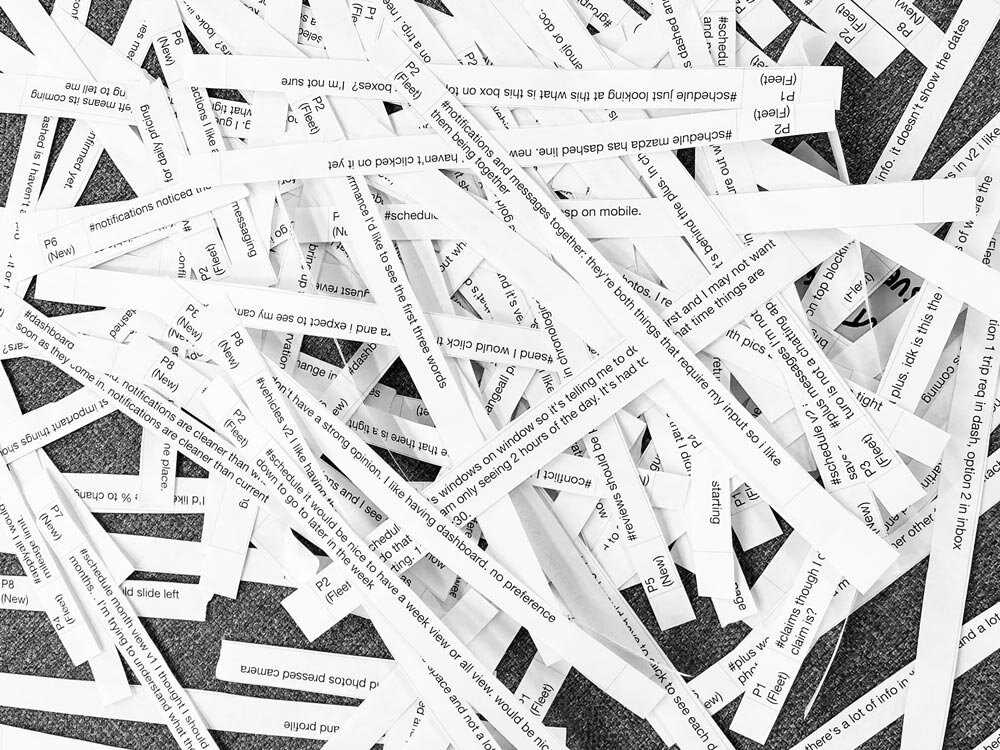
High level Insights
Prioritize actions and messaging the helps host manage their on-going trips and schedule first.
As Turo, we constantly want to put new messages in front of hosts to ensure they are performing at high standards. During the research this came in different forms.
Dashboard version where we prioritized status and performance above their trips today and calendar
Inbox version where we prioritized booking requests
All participants appreciated navigating to fewer screens to complete tasks because it saved time.
Most fleet host participants appreciated reminders to do infrequent actions like maintenance or un-snoozing a car.
Most participants appreciated being able to see the current status and a history of their performance, vehicles, and claims in the app.
Phase one outcome
We managed to complete our vision and research just in time to share with the executive team and product team before roadmap planning.
We influenced an entire team’s 2020 roadmap
We were thrilled to find that by presenting our vision in a tangible format, we actually were able to influence the 2020 product roadmap. One of our host cross functional teams was charged with improving host efficiency and several of the ideas from this vision project and the messaging vision project I lead earlier in the year would go on to influence what projects they would commit to building.
We raised the bar for the entire design team
Host mode was the first vision project that went through the entire double diamond design process. By completing this as a team, we set an example for other designers and teams to follow.
We came away with powerful insights we can still use today
The high level insights that ansaria uncovered help us make decisions in all of our projects.
What we could have done better
More collaboration with Product and engineering
While most reactions to the vision and presentation were positive, there was also some concern that design spent all this time on a vision but did not involve product or engineering. We realized if we involved our cross functional counterparts more we may have even more success influencing roadmap discussions in the future.
Creating cohesive concepts
Because we were so early in the wireframing stages when we tested, we didn’t have the time to make all of our prototypes feel like one app and tell one narrative. This really came out in the styling we chose to use, the type hierarchy, and even how a host accesses trips. If we had more time, we could have gotten there, but this project was about getting proof of concept out into hosts hands and getting signal that our vision was heading in the right direction.