Improving feature announcement strategy
Product design > Turo case studies > Vision : Recent updates
Synopsis
I led a vision project to increase awareness and adoption of new features and policies by improving the way we communicate updates to hosts. The project was green lit and eventually built and shipped. We were able to measure a 10% improvement in host sentiment toward how Turo communicates changes to hosts after the launch.
Details
Team: Host
Platforms: IOS/ Android/Web
Role: Principal Product Designer
Timeline: 1 year to get prioritized, 1 month to ship.
Skils: Strategic thinking, Ability to influence product roadmaps, UX/UI, user research
Company Problem
By 2023, our existing feature announcement strategy was handicapping teams abilities to meet feature adoption goals.
Examples of recent releases that had sub par adoption
Pricing insights: after launching insights to hosts designed to get them to more competitive prices, we realized that only 25% of hosts viewed the insights at launch.
Another team launched a messaging feature to improve host efficiency and reduce time it takes to send guests important instructions. The adoption of that feature was only 43%.
Turo integrated with several toll agency companies, allowing hosts to quickly track and manage tolls that are incurred on trips and request reimbursements from guests. The toll enrollment only accounted for 33% of hosts.
In another project I worked on, we spent over 6 months building the most robust fleet calendar tool to aid hosts in gaining visibility of their prices and trips across all their cars. Only about 52% of hosts viewed the calendar after launch.
Host sentiment survey results
Only 46% of 10+ car hosts felt Turo was adequately communicating changes
Hypothesis
We believed that the core reasons for low adoption had to do with hosts not being aware of the new updates.
Unpacking the problem
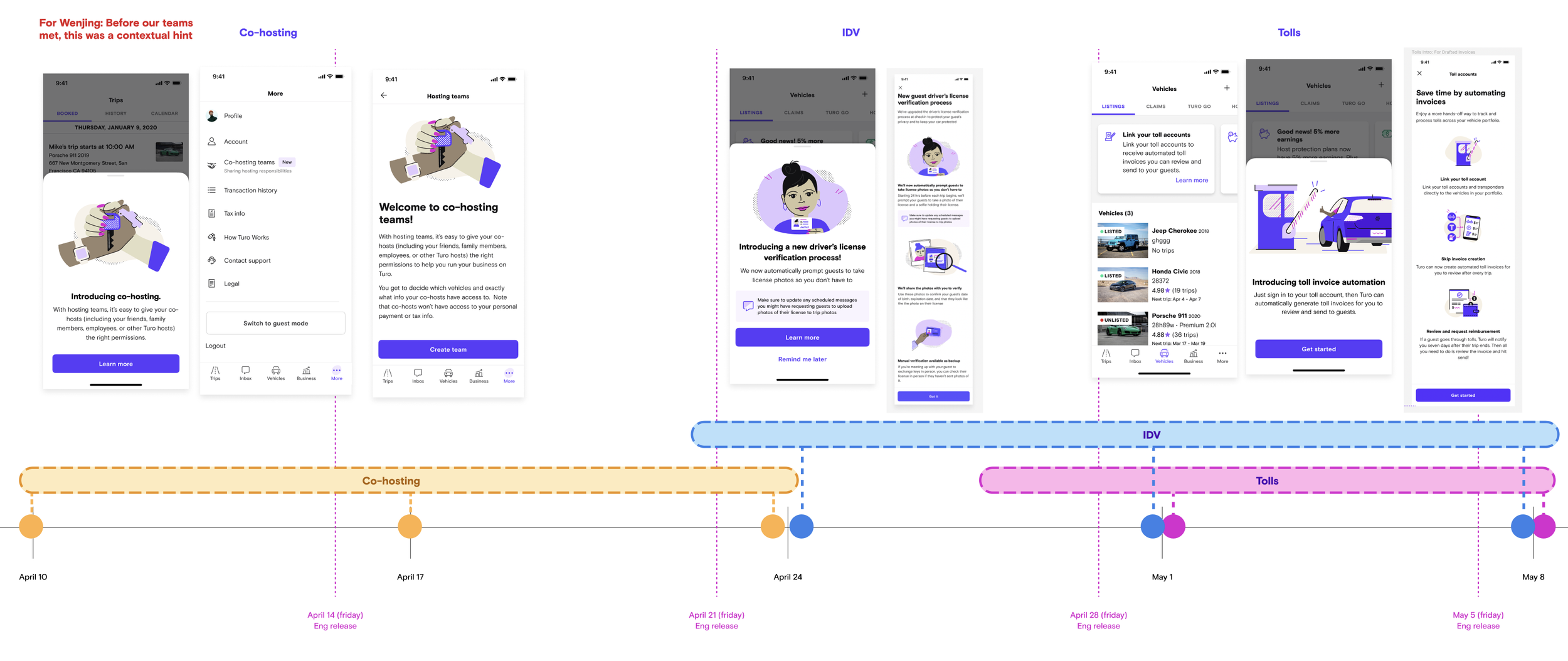
Our design solutions to notify hosts have become saturated over time
Multi-car hosts receive dozens of emails, push notifications, and activity feed messages a day. plus marketing emails. These range from trip-related updates and marketing. Emailing hosts about new product features just adds more flame to the fire. Emails have poor open rates and are most likely to be missed, making them a poor tool to rely on for communicating important updates
Red dots became pervasive.

Unpacking the problem
Our solutions have also become more more intrusive over time
We started with placing contextual banners at the car level, and over time we had 7 or 8 versions that sit in the same place, making it a challenge to prioritize and gain visibility for individual initiatives. The lower positioning in the host information architecture also makes discovery challenging
Next we moved on to a banner carousel at a higher level in the host IA. This was slightly more scalable, in the sense that we could display more at one time, but we know that priority order still matters and scrolling past the 3rd spot was low likelihood.
We started implementing more invasive tactics like tool tips, bottom sheets, and finally a marketing tool called airship.

Unpacking the problem
Every team resorted to using a non-scalable solution of displaying bottom sheets that pop up on app load.
This created non-scalable solutions when multiple teams wanted to launch feature updates in the same time frame.
Hosts would see multiple pop ups one after another, creating a jarring host experience.
Unpacking the problem
Building ephemeral bottom sheets costs us a lot of brand and engineering resources
Brand support
With every announcement Brand designs an illustration to accompany.
The illustration is only seen once
Engineering
Each team spends a lot of engineering resources to take down the previous bottom sheet and re-build their own version.
We now have so many that we have to build extra logic on priority order.

Goals and metrics
Primary
Increase adoption across future host features
Increase host sentiment toward how Turo communicates updates
How might we
Design a home for feature announcements and policy updates that is both discoverable, and scalable, to better support feature adoption

Concept one
Build a centralized page to display recent updates
What’s new page pops up on load if there are unread cards
Houses all the most recent feature and policy announcements in one place
Re-accessible from secondary entrypoint
Backend-controlled for simplified releases and cohesive experiences across platforms.
Pros
lower scope to update
Web-based, backend driven
Scalable solution - No fighting for priority
Re-accessible from app
Announcements persist, granting more visibility over time
Cons
Not a permanent solution
Still intrusive and disruptive
Requires effort to ensure navigating from push doesn’t get overridden
Must educate hosts on where to access “Recent updates” screen again
Concept two
Build a home tab to display all action items, updates, and important statuses to hosts at a glance.
More holistic approach to support multiple team initiatives
The MVP could display recent updates
Pros
Highest level of visibility
Scalable - No fighting for priority
Persistent access
Announcements can persist
Non-intrusive
If all updates are seen, we can still default to trips
No wasted engineering work
No required education to find re-entry point
No extra logic to ensure we don’t disrupt notification routing
Cons
Higher scope
Existing More tab moves into hamburger menu
Longer time to market
I presented these concepts to leadership as a means to get them prioritized. Leadership agreed on the solutions, but no team wanted to take on the work at that time.
So the project was shelved until I found more support..
Iterations
I continued to iterate on the recent updates screen…
I did several rounds of design explorations, seeking feedback from the team.
A few iterations

Variables:
Icon type and size
How best to represent read vs unread
Title only vs Title with body copy
Link or button
Illustration or icon
Labels or no labels
Designing the flow and how to re-access recent updates

Titles only, with labels
Titles for read, body copy for unread
All have larger images, titles, copy, and ability to add a banner and CTA
Only unread cards have larger treatement
Usability testing
The team still had these questions:
How do we reduce cognitive load in a list?
How do we make sure each announcement is seen?
Is more the right entry point to re-access this tab?
Do we need other entry points?
Goals of the test:
Validate the “recent updates” screen as an improvement on discoverability for new features and updates.
Does the what’s new screen have a higher chance of improving discoverability?
Can hosts locate the entry point to recent updates to re access the screen?
All participants noticed and interacted with the recent updates seheets.
5/5 participants scrolled up and down on the list before closing
Part three
Shipping
Once we got the host to the inspection settings page, we needed to balance the page layout to prioritize uploading the form with educating the host how to carry out the inspection.
Evolution of the safety inspection page
It took several reviews both with my product manager counter part and with the design team to balance the page with the proper amount of messaging.

Part four
Educating new hosts
Most of the project focused on helping existing hosts discover the new feature, successfully download the form and re-upload it. We knew there were new hosts that would list cars that were older and would be required to submit an inspection within the first three months of listing their car. We decided to update the post-listing flow content strategy to include this new information.

Existing post-listing experience
After a host completes a listing, a series of carousel messages were designed long ago to educate hosts on the “most important” information they need to know. The carousel has been added to over time and the messaging has become less succinct and focused. We knew we wanted to re-vamp this whole section, but time was not permitted, so we needed to at least find a way to include the inspection requirements without making the problem worse.

Updated post-listing experience
The highlighted pink sections are the areas we changed.
We replaced the bulleted list on the safety and quality standards page with subheads that made for easier scanning
We added a maintenance page to speak to the new maintenance requirements
We simplified the content on the refuel screen to only talk about refueling
We simplified the clean and disinfect screen to talk about the cleanliness requirements as well as the covid 19 training
Part five
Optimizing the upload form
This was a unique design challenge because we would be giving a host a digital pdf and they somehow had to have that PDF filled out either by printing it or sending it to their mechanic and then re-uploading a completed form.
Part of this experience is uploading images or PDFs and displaying that back to them. Turo historically had not developed a scalable solution to handle one off upload experiences. This meant extra complexity and time to build this feature.

The final prototype
I audited the guest booking funnel to identify the key places where the all-star host badge could live. What I soon discovered was how we display host information is inconsistent throughout this experience.

Usability research findings
We tested the flow with 6 Turo hosts in an unmoderated usability study to validate that the flow was clear and intuitive.
All hosts were able to successfully discover the new requirement via the banners and navigate to the proper location
This was enough for us to move forward confidently.
Final Outcome
We launched the program in October 2021 and as of January 2022, We had our first group of hosts who ignored all of our warnings both in the app and outside of the app, and had their cars unlisted. We knew some of this would happen as some of our supply is less engaged and motivated.
Overall, we know this was the right call, and even if it does churn a bit of our lower quality supply, we think it has done its job.
What I would do differently
At the end of the project, I was rolling off this team and moving onto two other teams and needed to offload some of the last of the QA and other responsibilities to another designer. Had I stayed on this team I would have advocated for a second follow up story, to add a filter on the vehicles list that would allow multi-car hosts to easily find the cars that had inspections due without scrolling through their entire list of cars.
Unfortunately, the new designer was unable to push for additional work and the team moved on. I would have liked to see this additional feature added as it would have unlocked other projects in the future.
Supporting designers:
Samantha Hensley: Illustration support
Shaina Castelo: Production work + last round of QA
View other host quality initiatives:
Part three: Granular ratings