Helping new hosts get excited about listing on Turo
Product design > Turo case studies > Growing activated supply : Pre-listing experience
Synopsis
Turo is the largest peer to peer car sharing company in the US based out of San Francisco. It serves as a marketplace for people who own cars (hosts) to share their cars with people who need a car (guests).
In 2019 my team focused on improving new host acquisition and vehicle activation. This was one of multiple projects geared to improving the listing flow conversion and enabling new hosts to be committed and prepared.
Details
Team: Host Activation and Quality
Platforms: IOS/ Android/Web
Role: Lead product designer (Design lead on a cross functional team)
Timeline: 2 months
Skils: UX/UI, User research, Journey mapping, Design strategy
Company problem
Only 58% of prospective hosts who found the five value proposition screens before the listing flow actually went on to start the listing flow.
Hypothesis
If we better communicate the benefits of hosting and address common concerns, prospective hosts will be more likely to list their car.
We conducted multiple methods of research to uncover the pain points associated with the low conversion rate.
Heuristic evaluation
One of our researchers, Angeline Vu, conducted a heuristic evaluation of the end to end listing flow experience and brought to light major short comings in our content strategy. She indicated that it’s very likely users conduct a google search to find information about Turo’s policies.
Design audit
I took a look at the experience from a UX and Visual design perspective and highlighted poor legibility, outdated design patterns, and problematic UX.
Interviews with Hosts
Our lead researcher, Nate Mahoney, conducted interviews with existing hosts on their experiences navigating through the listing flow. Later, another researcher, Ansaria Mohammed, led two studies to understand host sentiment and host churn.
Shadow calls with our Sales teams
At Turo, we have a sales team that reaches out to hosts who abandon the listing flow to answer any reservations and concerns. I interviewed and shadowed them on a few calls to understand what information was missing from the listing flow.
Competitive analysis
We looked at listing flows and sign up flows from similar companies including Airbnb, outdoorsy, getaround, and more.
Designer led research
A fellow brand Designer, Nate Mandreza, redesigned the landing page on web and tested the redesign with users. I was able to leverage his insights and make informed decisions on my own work.
Insights
Not enough information
The lack of information about insurance is one key factor for abandoning the listing flow or cancelling a first trip.
“I want more specific information about how the vehicle is protected as far as insurance goes. It’s most important because it gives me peace of mind that I’m protected.”
-Host participant, Host listing research 4/2019
“Turo did not explain how anything works before listing my car online! I thought they would spell things out clearly... No you did not! Not even a little!”
-P11, 0 trips Host churn research 11/2019
Hosts most commonly asked “What happens if my car get’s in an accident? What happens if the car get’s stolen? What happens if someone gets hurt”
- Interviews with Sales team
Current native flow
On launch, a prospective host lands on search tab, a tab optimized for the guest
All of the “value proposition” information about why you should list your car was gated behind a sign up flow.
The “value proposition” screens themself were not very aspirational, nor did they contain the right amount of information on the right subjects.

Significant drop off before the host even entered the flow
Current web flow
Our landing page was drastically out of date visually.
The page was unfocused with way too many CTAs that lead away from the listing flow

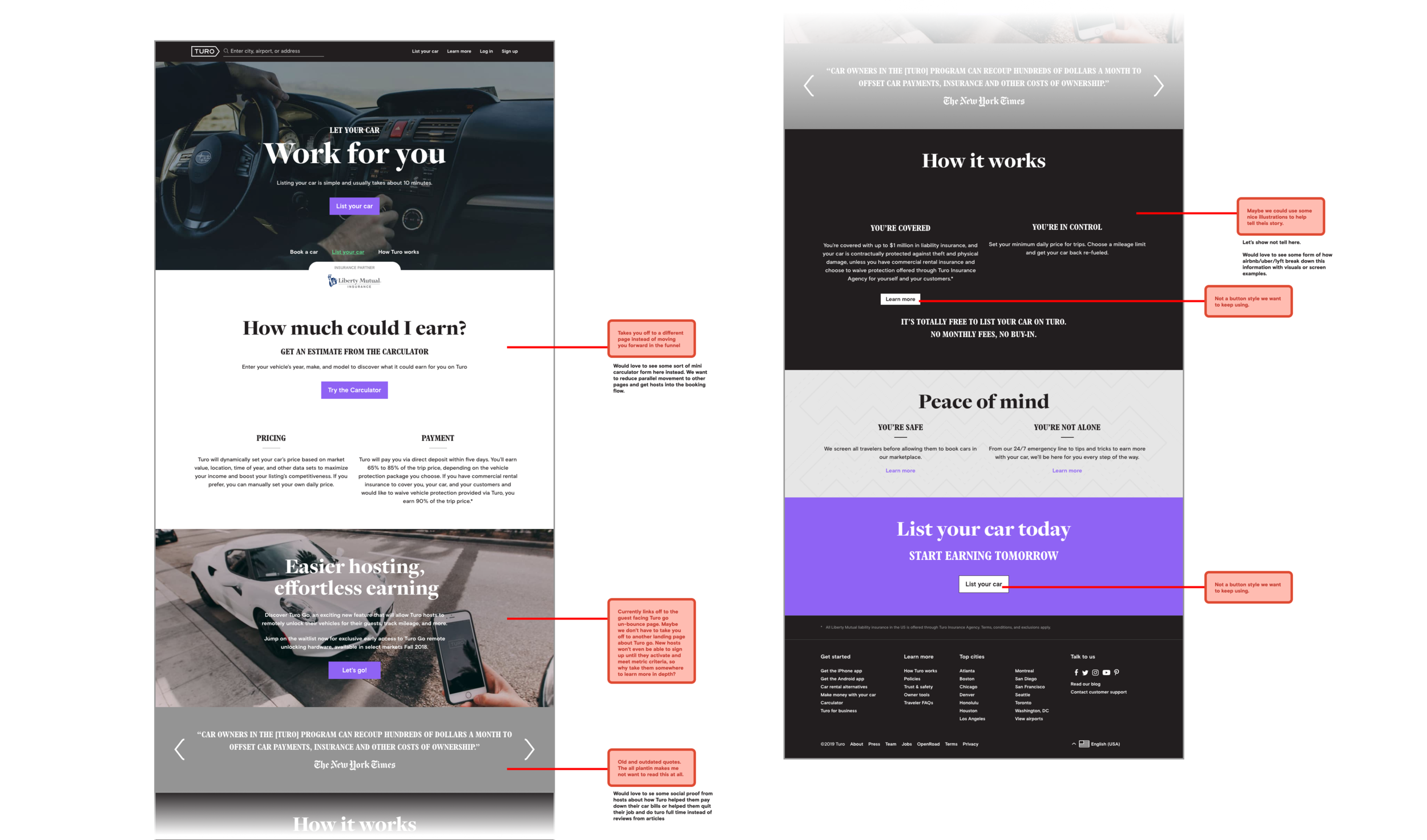
Significant drop off before the host even entered the flow
User problem
How might we give hosts the information they need to feel comfortable listing their cars on Turo?
Competitive analysis
We looked at many peer to peer and gig economy apps and websites to see how much information they were displaying on a host landing experience.

Significant drop off before the host even entered the flow
Part one
Divergent concepts
I explored several high level divergent concepts that answered these three questions:
What is the right layout for the content we need to show?
How do we give just the right amount of information on protection to give hosts confidence to proceed?
How do we get hosts excited about how much they could earn?
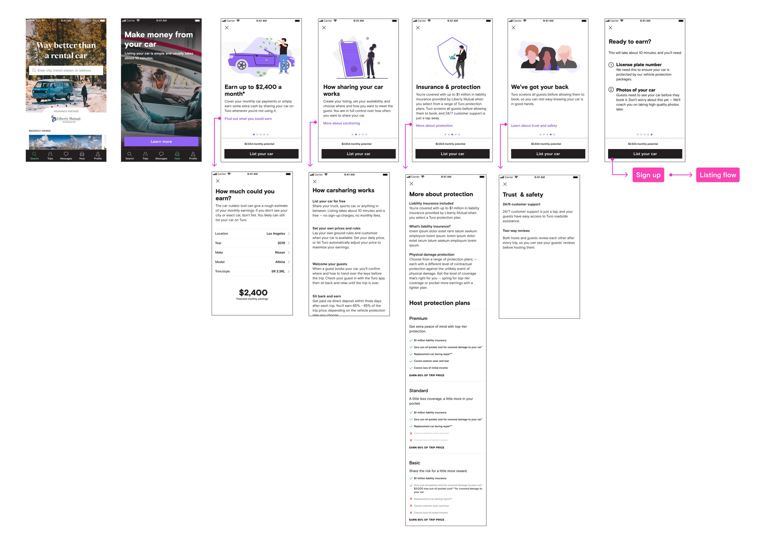
Content layout concepts
Because we needed to show a lot more content, I needed to find a way to display that information that was engaging and wasn’t overwhelming.
The main question: How much of this content is required reading before joining? Should the user be able to skip? Should we persist the list your car button on the screen or display it at the end once they have gotten through the content?
Carousels
My first explorations was to continue to use carousels to message the important information hosts needed to know upfront.
Cons:
We had so much more information to share both in number of subjects as well as in length of content, it would have made balancing the page difficult.
Pros:
Each message would be focused and live on it’s own screen
Competitors like Airbnb were using this pattern which gave us confidence that it was recognizable and it worked

All in one page
I also explored directions that mirrored the web landing page version. I had a hunch that users didnt mind seeing it all in one page and having to vertically scroll as much as they minded having to horizontally scroll.
The opposite end of the spectrum was using organizational tabs at the top to organize the content into three sections.
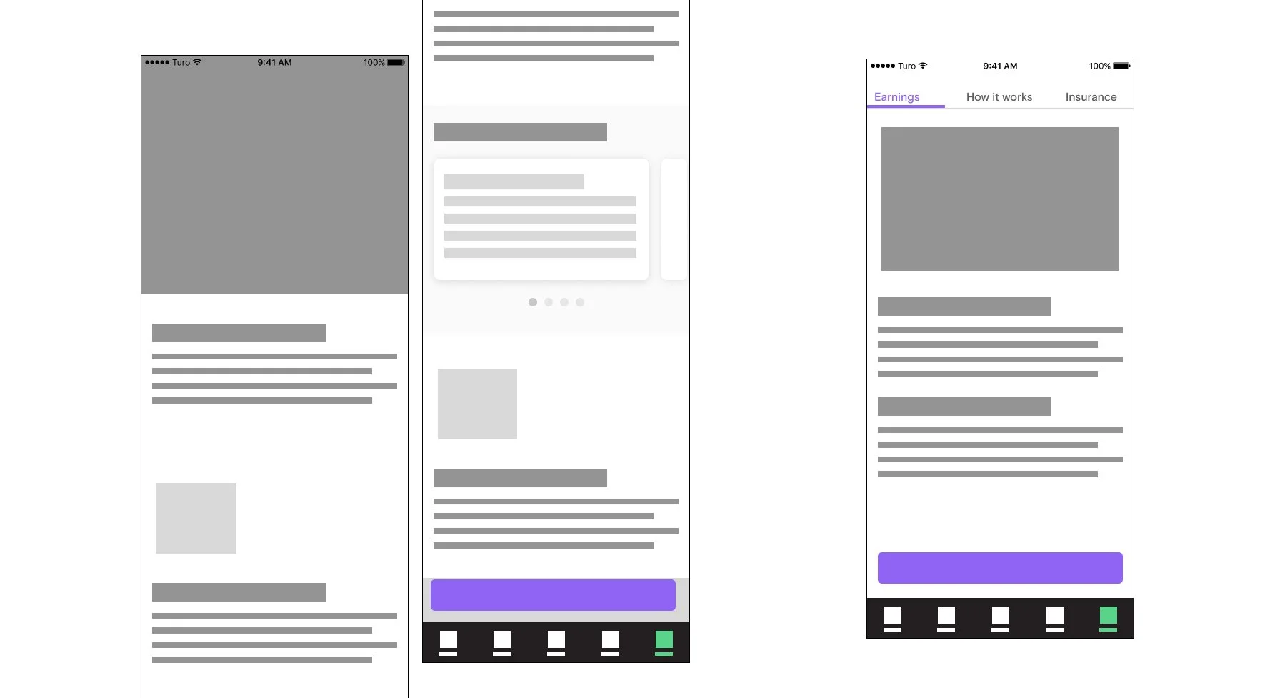
Chapters
I thought maybe seeing the high level sections of content in a chapter view would be more helpful for scanning.

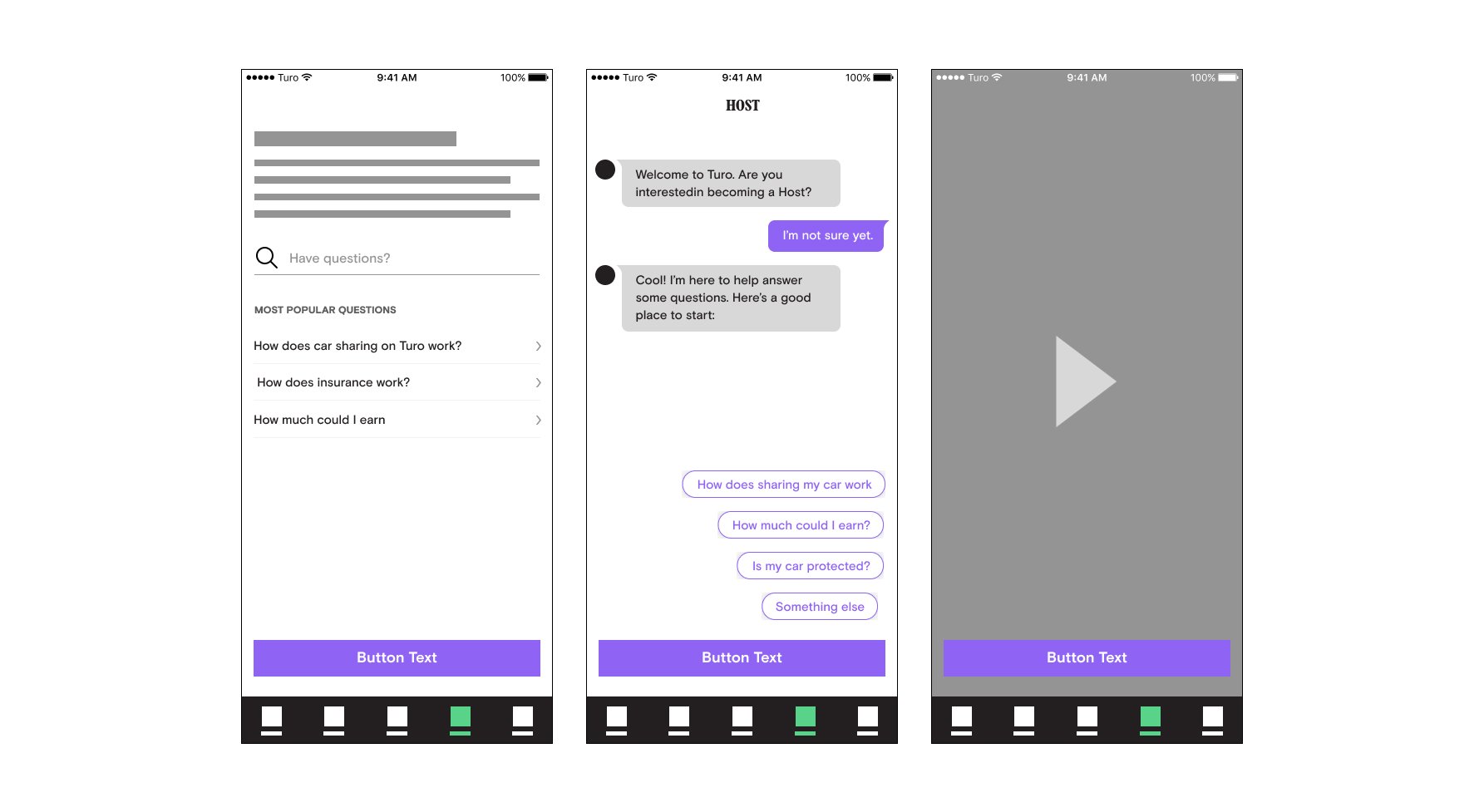
Crazier Ideas
I went even wider, wondering if a less read-only approach was more engaging. These were interesting conversation starters, but ultimately were discarded early on as they would require a lot of scope to build
Screen one: Allow the host to search FAQ style for questions
would have required writing a lot of pre-canned answers to questions we didnt know they had and we weren’t confident in our abilities to pull that off.
Screen two: Chat bot
An interesting Idea, but flawed for the same reason as the first. We didn’t think we could give enough flexibility inside a chatbot to answer enough questions
Screen three: Video
While we thought the video idea would better show off our brand, videos are costly to make and get outdated too fast. We also thought some hosts might not want to sit through a video and would prefer to read or find the targeted information they were looking for at their own pace.
Protection display concepts
In order to truly get hosts to hit that “list my car” button, we needed to answer the questions that followed the phrase “what if?”
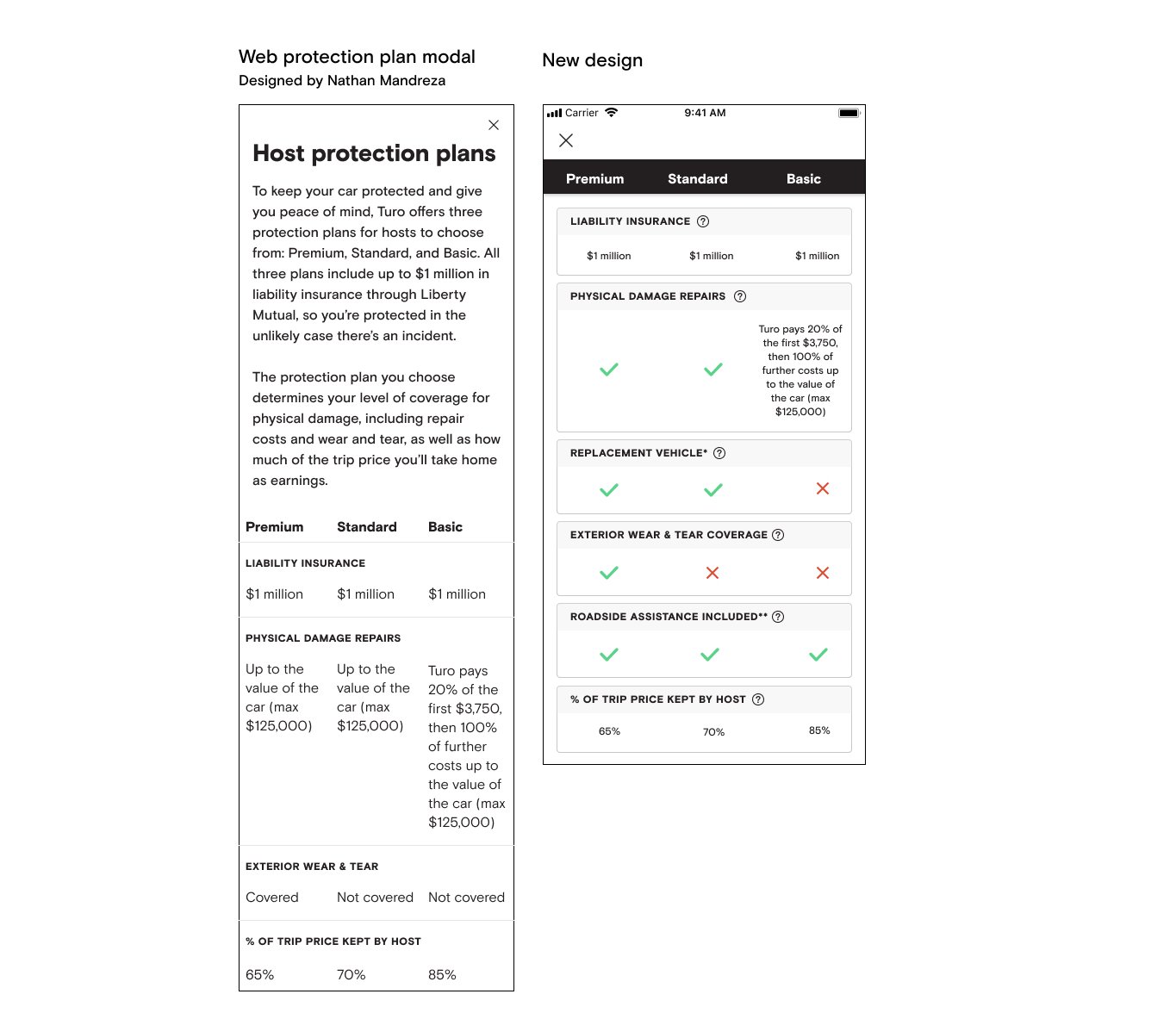
Unfortunately, our legal team was incredibly bullish not to talk about protection in any sort of scenario because it could open us up for liability. The next best thing was to help hosts understand that Turo offers multiple protection packages that have varying levels of coverage, and to show what the varying levels are.
The challenge: Display a lot of information that needs to be compared concisely and intuitively
Chart comparison
This approach was the most in-line with what the web version of the page was shaping up to look like. A Brand designer, Nate Mandreza was responsible for designing the equivalent of the native experience on web.
Horizontal scrolling comparison
I thought this felt a bit more native than a static chart, but it had it’s downsides, particularly in how custom the design was and the complexity of the interaction.

Vertical cards
This is kind of the standard for how we had been displaying protection in other areas of the product. I made some changes to show more clearly what was included and what was not.

Earnings display concepts
How do we get hosts excited about their earnings?
We knew the main headline
The challenge: Display a lot of information that needs to be compared concisely and intuitively


Part two
User testing
After going through several reviews, we narrowed it down to these concepts to test:
Layout: carousel vs chapters
Protection display: chart vs cards
1 Earnings calculator concept
Prototype one: Carousel
Prototype two: Chapters

Findings
Most participants (4/5) preferred the chapter view
Most liked the ability to see all the subjects and pick and choose what they wanted to drill into to read more. The only comment a few of them made was that they liked the larger visuals of the other concept.
“I think this is helpful because it shows all on one page what's happening. It's a little more succinct, so i like that.” - P2
Many participants (3/5) preferred the protection cards
Hosts found it easy to compare the features because the checklists had the same content. It made it easy to see visually how many features were included in each protection package and see the value add as the price increased.
Further updates
Based off the user feedback, there was a desire to make the first screen more visually interesting. We added a hero photo as an aspirational Turo brand moment, and made the icons larger. The design remained cohesive by tieing the Illustrations in “learn more” modals back to the simplified icons. The earnings figure (in purple) is updated from carculator and saved if host makes a change in the tool.

Part three
Outcomes
We launched the non-carculator version of the pre-listing flow and the new list your car landing page (designed by Nate Mandreza) mid-December 2019.
We measured:
Saw pre-listing experience -> created listing
Saw pre-listing experience -> enabled listing
Saw pre-listing experience -> booked trip net of cancellations

Hosts who saw the new
pre-listing experience were
35% more likely to tap “get started”


Hosts who saw the new
pre-listing experience were
18% more likely to Create a listing
(Complete high-friction VIN step and hit “Next”)

Part of the listing flow - Screen was not altered in my designs

Hosts who saw the new
pre-listing experience were
10% more likely to Publish a listing

Part of the listing flow - Screen was not altered in my designs
Regarding my contributions
Every designer at Turo works on a cross-functional team dedicated to core metrics. I was the design lead, with a product manager and Engineering team as my counter parts. We pulled in additional support from brand designers, copy writers, marketing, legal, data science, research, sales, ops, etc. to help shape the direction of the feature.
Supporting designers/Researchers:
Nate Mandreza: Designed the web “List your car” landing page
Ansaria Mohammed: Research
Nate Mahoney: Research
Angeline Vu: Research