Building hosts’ trust with indispensable data to help host pricing match demand
Hypothesis
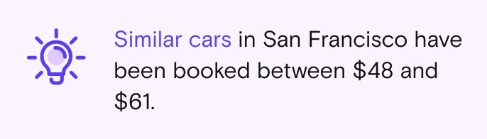
If we give hosts insights that show them the prices of similar cars that were successfully booked, they will have much better competitive data to compare and make decisions from.
We’re calling this data Trending price.
It’s fed by historical information
Average price of similar Make/model/year in your market area over the last calendar month
Updates once per month
Details
Team: 1 PM, 1 Engineering manager, 8 engineers, 2 designers, 4-6 Data scientists and data analysts, and various executive and director level stakeholders.
Platforms: IOS/ Android/Web
Role: Lead product designer
Timeline: 6 months (3 months for discovery and design, 3 months for execution and QA)
Skils: UX/UI, User research , mentorship, stakeholder management, influencing, leadership and direction
Background
What is Automatic Pricing?
Automatic Pricing (AP), is a predictive model designed by Turo to set prices based on supply and demand, with the goal of regulating prices to optimize for revenue.
The price will fluctuate every day. Generally weekends and holidays are higher than weekdays and “low season” days.
A new listing is defaulted into AP without telling hosts
Hosts can override any prices on the calendar


What is Manual Pricing?
If a host opts out of Automatic pricing, they are in Manual pricing.
They set one price that will be static across all the days in their calendar.
They can override any of the prices on the calendar manually

Business Problem
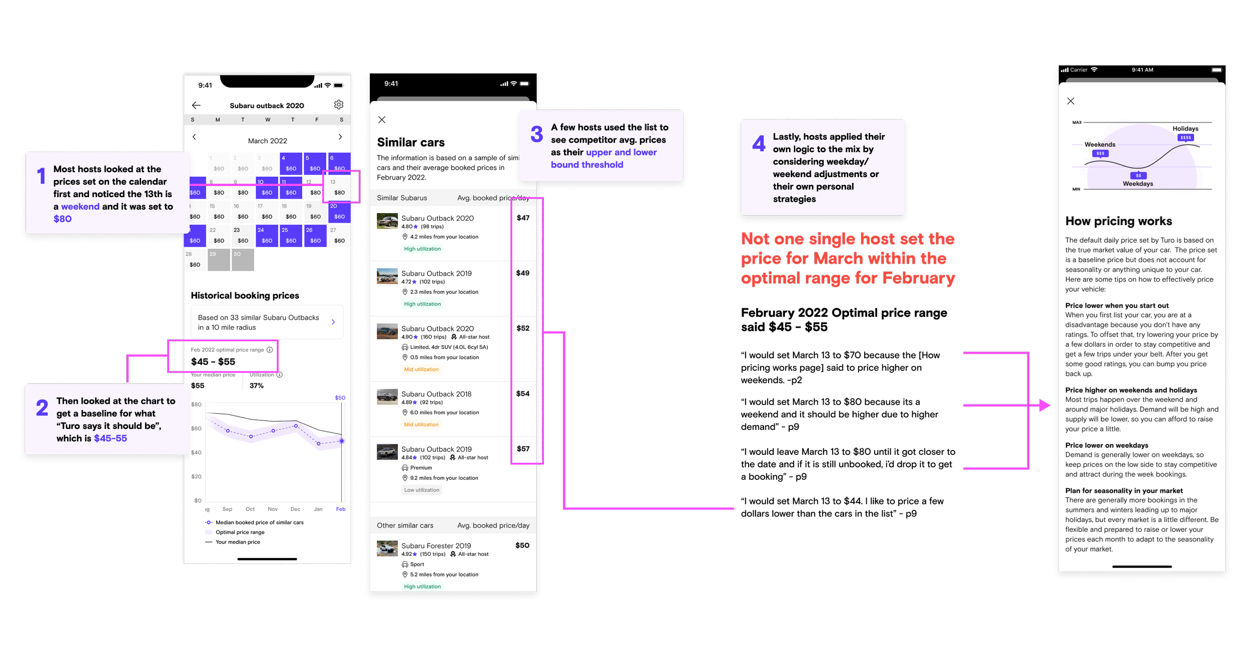
Rather than trust Automatic pricing, hosts referenced inaccurate sources to define their prices
Through data and research, we discovered hosts used Turo search to compare similar vehicles in their market to determine their vehicle’s price. The data team determined the cars that are still in search are the unbooked cars, and they likely were unattractively priced.

User research
Why are hosts opting out of Automatic Pricing?
Misalignment with markets
Some hosts noted that the pricing was far off from what they had seen in the market (in search), that it had to be inaccurate.
When hosts changed the prices and got bookings, they further reinforced their confirmation bias that AP was unreliable.
Different segments of hosts had opposite opinions on why AP was inaccurate
41% of high earning hosts said Automatic pricing was too high
41% of casual hosts said Automatic pricing was too low.
Lack of transparency of what data Automatic Pricing is based on
Some hosts noted that features, trim level, and edition of the vehicle didn’t seem to be considered in Turo’s recommended price.
User problem
Design audit
Our design audit revealed there were too many ways to set a price which could lead to confusion
Toggle automatic pricing on and set a price range
Toggle automatic pricing off and set one price for all the days
Override any of the prices on the calendar
The calendar controls also did not optimize for setting prices efficiently across multiple days.
Hosts have to change prices for individual days manually
Hosts with a large fleet, spend hours editing prices on a weekly basis.

Design problem
How might we earn back hosts trust and give them a way to set better prices that doesn’t involve leveraging bad data?
Challenges
This was a data-science led project
From the very start, data scientists led the discussion on what data would define the insights we provided, which meant myself and the other designer had to interpret complex data advocate strongly for hosts needs.
Misalignment across many stakeholders
We had a large cross-functional team made up of designers, pms, engineers and data scientists and analysts. The Data Scientists tried to heavily influence a more business-driven solution without taking into account the hosts needs and wants.
High Pressure to move fast and skip research
Our product manager pressured us to skip steps in the design process, such as research and reviews to try and expedite the process. There wasn’t any business-oriented reason for needing to expedite solutions that were unfounded by research, so I spent a lot of energy advocating for research and the design process.
Complexity in our Data led to scope creep
Every time we presented a simple solution, the data science counter parts would provide feedback about how it needed to be visualized in a more complex way to ensure hosts understand the data. This meant we had to churn out more and more concepts to account for every issue and request that was thrown our way.
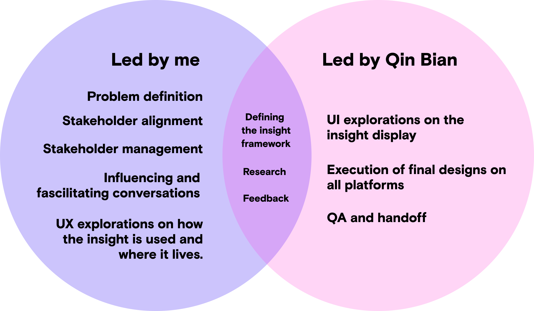
My contribution as Lead Product Designer
I co-designed this project with a mid-level designer, Qin Bian. We collaborated heavily in the research and discovery phases, and I gave feedback and direction to Qin on all of her work. We split the project into two sections:
Qin led defining the UI of the insight
I led defining the high level design strategy and the location of the insight
Early discovery phase
Working toward alignment
Despite pressures from product management to skip steps and work fast, we took the time we needed to get better acquainted with the problem.
We agreed upon a set of principles to help guide our direction
We facilitated workshops to align better on definitions and goals
We shared insights from data and host responses to ground everyone in research
We conducted multiple rounds of usability research to help us narrow down solutions (seen in the design phases)
Aligning on guiding principles
In an effort to better align with our data science and analytics counterparts, we all stacked hands on principles that would guide the project.
Prioritize simplicity:
Pricing data is complex and hard to follow, even for internal employees. We strive to make sure our insights are simple to digest so that any host can interpret them correctly.
Insights before predictions:
We knew that we weren’t yet good enough at predicting the future, so we decided to focus on historical insights.
No data is better than bad data:
We didn’t want to continue our precedent of “guestimating insights” in certain cases we had no data. We resolved to show nothing at all or be transparent when we don’t have enough data to give an insight.
Workshop
I led a workshop that answered “what does ‘simplicity’ mean in pricing?”
Qin and I were noticing a lot of misalignment in direction and ideas in the early phases of the project. To combat this, I led a workshop sticky note exercise to get our stake holders to define some of our principles more granularly.

Sample stickies from our workshop
Part two of the workshop focused on the question “What does it mean for data to be ‘trustworthy’?”
We had several discussions about how to display data that is trustworthy. A lot of this was around which type of insights, and how much specificity can we give without losing out on volume and accuracy of the data.
It came down to five themes:
Transparency - Tell me how it works, what is the data based off of, and prove that it works
Accuracy - This data needs to be accurate or i can’t use it. Let me provide feedback to make it better
Consistency - In addition to accuracy, the data has to be consistently accurate
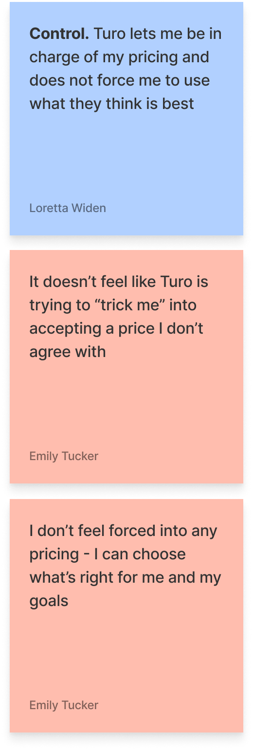
Sense of control - Hosts want to be given information without being forced to take Turo’s recommended price.
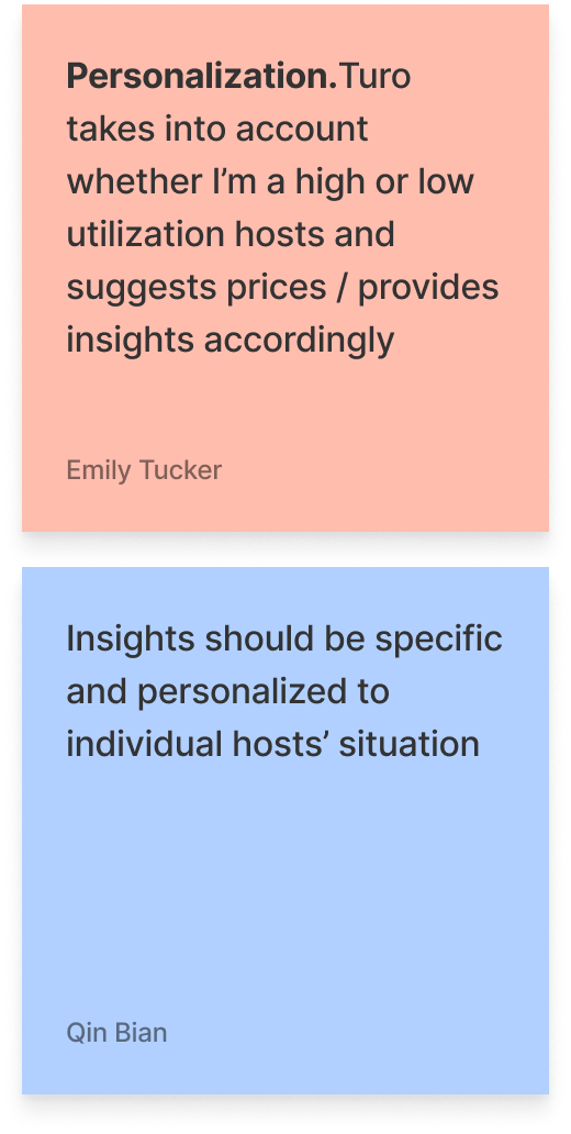
Personalization - The more personalized to my unique vehicles, market, and pricing strategy, the more likely i am to accept and adopt.


Analyzing data
Decoding the complexities of pricing, utilization, supply, and demand data
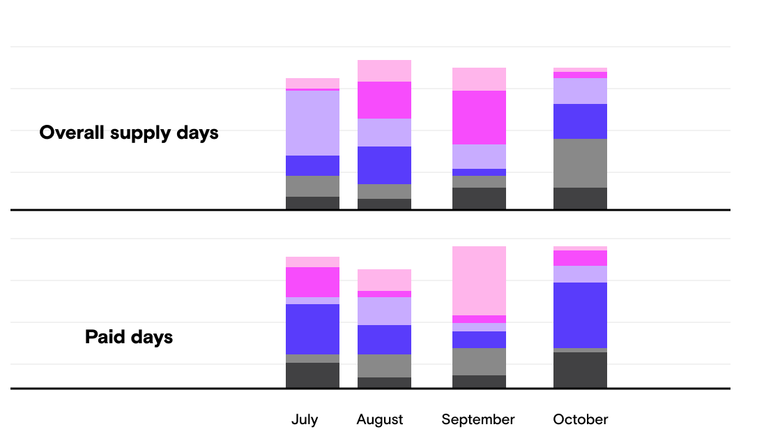
In weekly working groups, our data science team presented a lot of complex charts on historical pricing, utilization, and supply. Their hope was that we could some how design similar charts for hosts and place them in the product.
We knew these types of charts were great for internal use, but would be too complex to show to our hosts.


Aligning on measuring success
What does success look like when you want to increase trust?
Because our goal was to increase host trust in Turo’s data, we didn’t yet have any way to track if we were successful. As designers, we kept asking if the point was to get hosts to adopt the pricing recommendations, but stakeholders were not comfortable naming an exact quantitative metric to track our efforts against.
This proved to be challenging for designers, as we needed to test our designs against something in order to know if the designs were successful.
In the end, we partnered with our researcher to develop an in-app contextual survey that is designed to measure host sentiment around the feature itself and measure trustworthiness of the information.
Competitive analysis
Analyzing how pricing data is displayed elsewhere
We analyzed other market places like Airbnb, Etsy, Getaround, and thumbtack for ideas on how and where to display pricing insights

Taskrabbit uses gradients to indicate attractive pricing

Stock X shows historical prices
Fleetsy bar graph

Getaround shows weekly trends


Design phase - led by Qin Bian, supported by me
Defining the insight
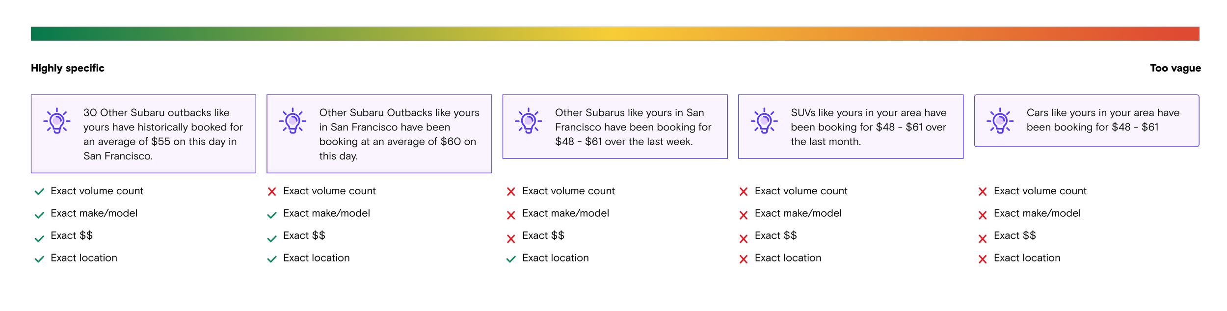
We now understood the problem space well, but we felt there wasn’t a clear definition of how to visualize the insights:
What kind of data can our data science team provide reliably?
What kind of framework is most compelling to hosts?
What level of specificity will instill trust in the insight?
What cars do hosts consider to be “similar cars”?
How much distance away from a hosts location is still considered “within the same market”
What is the minimum number of cars we can base the insights off of?
What is more helpful? A price range? or a fixed price?
What is the timeframe for the historical insights?
Is it a rolling 30 days?
Do we show 12 months worth of historical data?
When does the data publish?
Once a month?
Daily?
Workshop
Exploring different insight frameworks
I used quick, text-only designs, to lead a discussion with our stakeholders understanding their perspective on which insights we could theoretically visualize with data.
The goal would have been to test these high level concepts with hosts, to understand what would be the most compelling and acted upon, but the data team had already been building out the same make/model trending price, so we were forced to continue with this insight, despite my reservations that this was going to be effective and useful for hosts.

Exploring levels of specificity
My hypothesis was that the more specific and unique the insight is, the more it will appear trustworthy. I led a discussion with the data team about what we could accomplish. We also made an effort to test various written concepts along with visuals to get answers to:
How do we define the “market”?
What do hosts expect? How far is too far away to compare other similar cars? For example, if I am a host in Phoenix, if i see data for cars in Scottsdale, is that useful or not useful?
How do hosts define “other similar cars”?
Do hosts want to compare exact make/model or similar cars or both?
Creating divergent ideas and sacrificial designs.
Qin and I both brainstormed ways to display insights and every time we reviewed designs internally, the team brought up more constraints, and different ideas for charts which lead to a lot of spinning our wheels, and not really converging on one idea.
Qin did most of the execution of these charts, while I designed a few ideas and mostly gave feedback and helped her interpret the feedback from the team.
Usability testing
Converging and testing the insights
With so many concepts, and little understanding into how best to display this data, Qin conducted multiple rounds of usability research to converge on a design. The main questions we needed to answer:
What is the right format?
Text, chart, or displaying the cars and their booked prices themselves?
What iteration of the best format is the most useful and clear?
Do hosts prefer forward looking data (predictions) or past looking data (trending price)?
What level of specificity is trustworthy for a host?
How do hosts define similar cars?
How do hosts define “same market?”

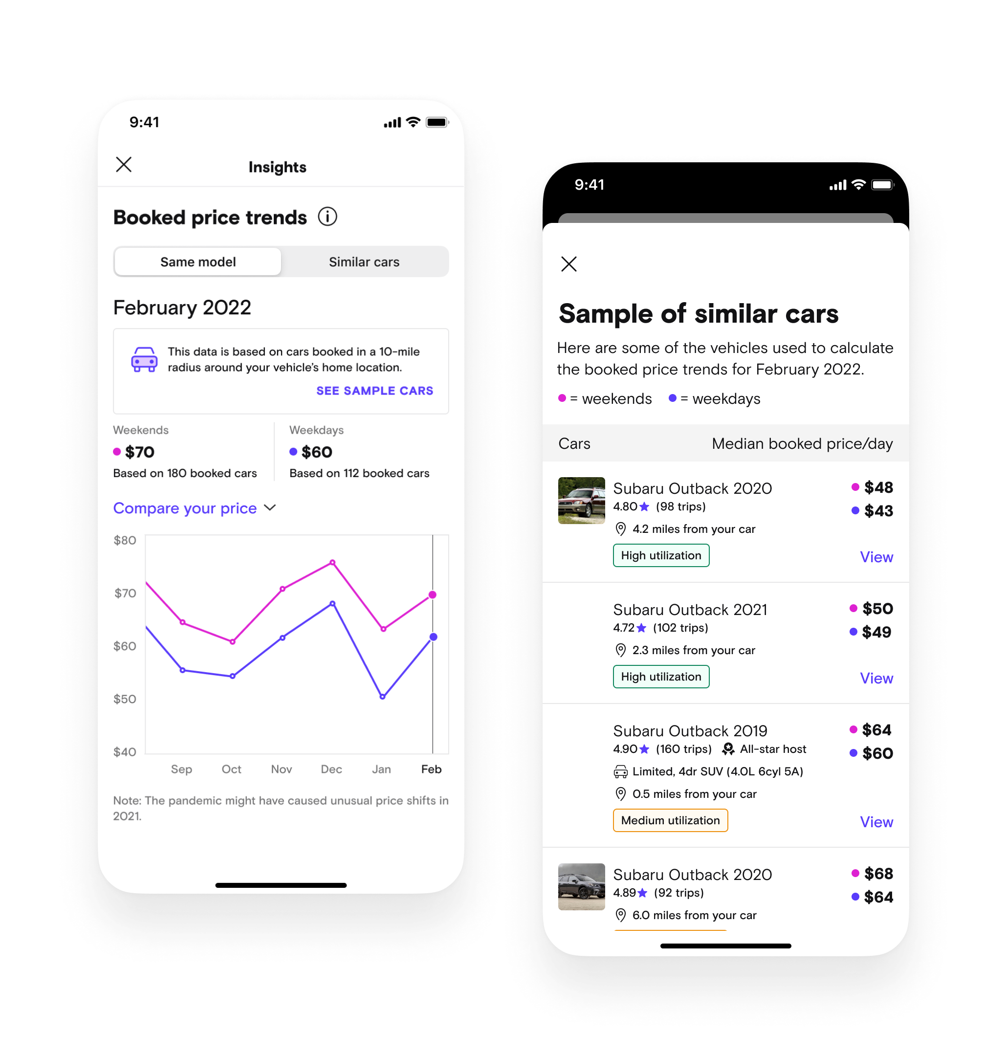
Screenshot from our Turo employee host internal testing zoom call - we tested with 5 Turo employee hosts
Testing round one: Get directional feedback from internal employee hosts.
Which format (text, chart, or list of actual cars) is the most actionable and easiest to understand?

If employee hosts selected the chart as the best option, Qin followed up with other iterations to get opinions on which one was easiest to read.

If employee hosts preferred the car list view, Qin showed three iterations of the list view concept to understand what was most important to hosts.

Insights from the first test
How do hosts define similar cars?
For cars to be comparable, hosts also look into how the car will lead to similar experiences:
Host status: more experienced hosts = more reliable prices
Ratings: highly rated cars can charge more
Reviews: new hosts should lower their prices to get bookings and good reviews to develop trust before raising prices and optimizing for earnings.
Trim and style: For high-end cars, trims can be more important than years.
Whether hosts offer delivery: delivery is especially important for hosts who serve airport areas.

How hosts perceive “the same market” can vary from area to area.
One host based in Phoenix felt the same market is roughly defined by 30 miles radius.
For another host based in San Francisco, the San Francisco, Oakland, and San Jose cities are all different markets (roughly 30 miles radius).
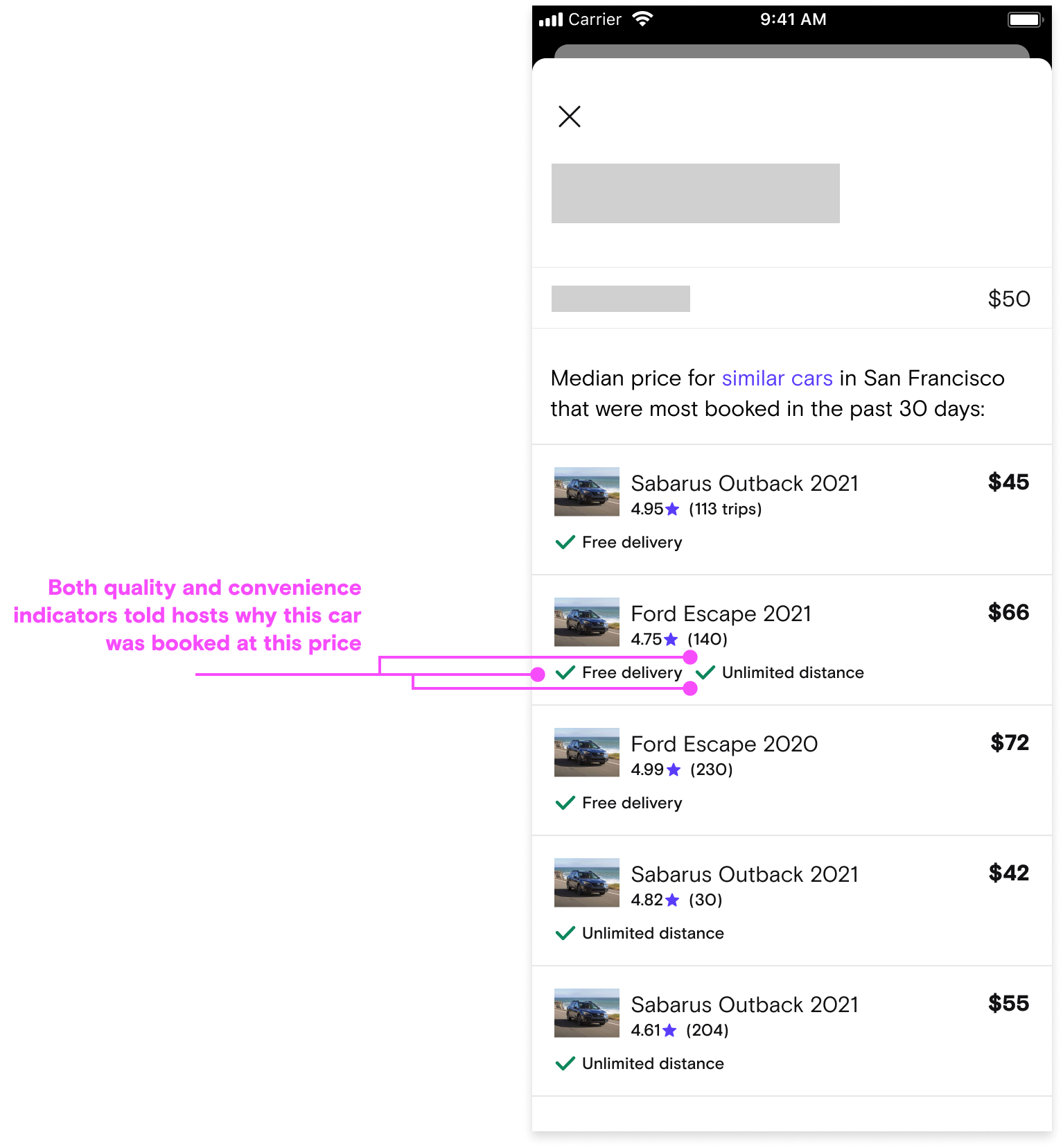
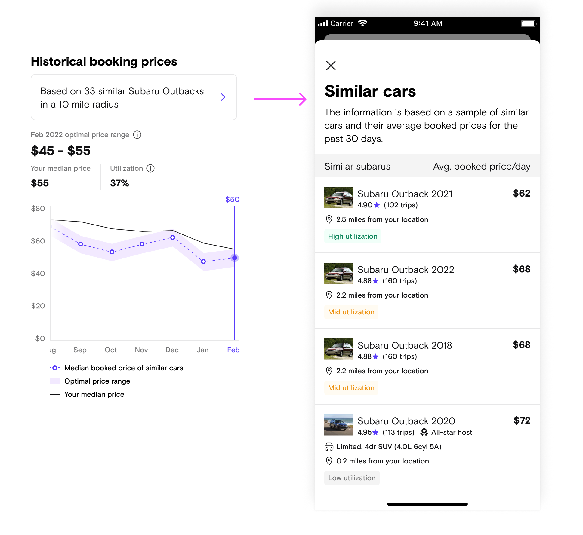
All three insight formats had positive feedback, but most hosts preferred the vehicle list-based design
The list-based design explains why certain vehicles are booked at certain prices. (Can I price the same?)
Helped hosts understand what “similar cars” entails, which boosts their confidence in the relevancy of insights
Explained why customers choose other vehicles over theirs

Hosts called out that trending price didn’t give them the full picture
Hosts wanted to see nuances between weekend vs. weekdays because they knew that prices should be different and they didn’t know if the trending price insight reflected weekday prices or weekend prices.
Hosts wanted to see the current supply and demand for that specific day
Iterating and re-testing
Qin presented her findings from her internal study to the larger team and iterated. With the help of our new researcher, Wenjing Yang, we tested a smaller set of designs again and got even more clarity.

Insights from the second test
The most useful insight design was concept 5, the trending prices based off similar cars list.
The least useful was concept 4, average earnings per prices.
Design phase - led by myself
Defining the location of the insight
I led the high level design thinking and strategy behind how the host locates and uses the insight in their workflow.
Concepts
Exploring a scalable solution for pricing insights to live
I explored several concepts trying to find the right entry point and placement of the insights to ensure they were east to discover and act upon.
Concept one: Contextual insights where you go to change your price
Pros:
Easy for hosts with high intent to change prices to reference while making changes
Cons:
Not very discoverable if we’re trying to influence you to change your prices
The historical trending price is a very static and is not a unique insight that changes daily, which meant the information will only be repetitive and distracting in this location
This location is not well suited for multiple insights, should we decide to add more in the future

Concept two: Separate page for insights
Pros:
Easy to discover
Very scalable for adding more insights in the future
Cons:
Not the best solution for a host’s work flow. The host has to tap in to view insights, tap back out, then tap into a day to make edits.

Concept three: Inline with the calendar
Pros:
Most discoverable option
Most likely to influence hosts to changes prices before they decide they need to
Cons:
Reduces hosts ability to see multiple months in the same view
Not very scalable for adding future insights
Added complexity with what to show for insights in past months
Usability testing
Testing our best guesses
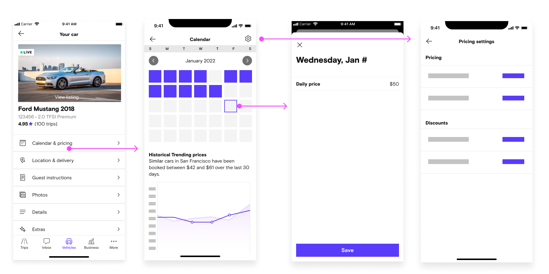
After internal reviews, we tested two of the three concepts: Inline with the calendar, and on its own page. We made some design revisions and I inserted the trending price graph Qin had iterated on after her second test
Questions I had:
Discoverability: Which options were hosts able to locate the insights the easiest?
Comprehension: Could hosts understand what the insight was saying and how to interact with it?
Utility: How do hosts use the insight in their workflow?

Both designs also featured the similar cars list that are accessible from the banner.
Insights from unmoderated usability testing
8/8 hosts were able to locate the insight on option A (inline) and 3/5 were able to locate the insight on option B
Not a big surprise here. The inline version was on the page and easy to discover if the host scrolled

Most hosts had favorable things to say about the insight or were neutral
One host wanted to check the prices against search, but found it more helpful once he clicked into list view:
"This is actually really helpful. That way i dont have to look at the map and do filters" -P2
But some hosts said the insight wouldn’t be very useful
“It's nice but not going to help me set prices in the future” -p8
“This graph isn't really helpful for me. It's dense with information that is probably useful but the way it's designed, i have to think a lot. The optimal price range is a shaded area above or below, but visually how can i tell if thats within two dollars or five dollars. I can move it but i can't zoom into it.” -p4
“If I have 100 cars. I dont want to go car by car. I dont want to change price one by one. I want to chunk out a whole week. Say it’s spring break, i just want to select it all in one and increase or decrease it. ... Im not actually going to use this [calendar and insights] if i can’t change the whole fleet all at once.” - p15

Mosts hosts that took the time to read the chart were able to decipher it
Most hosts used multiple inputs to decide the price:
Whats the price is currently set to on the calendar?
What does the chart say is the baseline
What specific prices are other cars doing
Is it a weekend or weekday or holiday?
What’s my strategy?
Iterating on option B
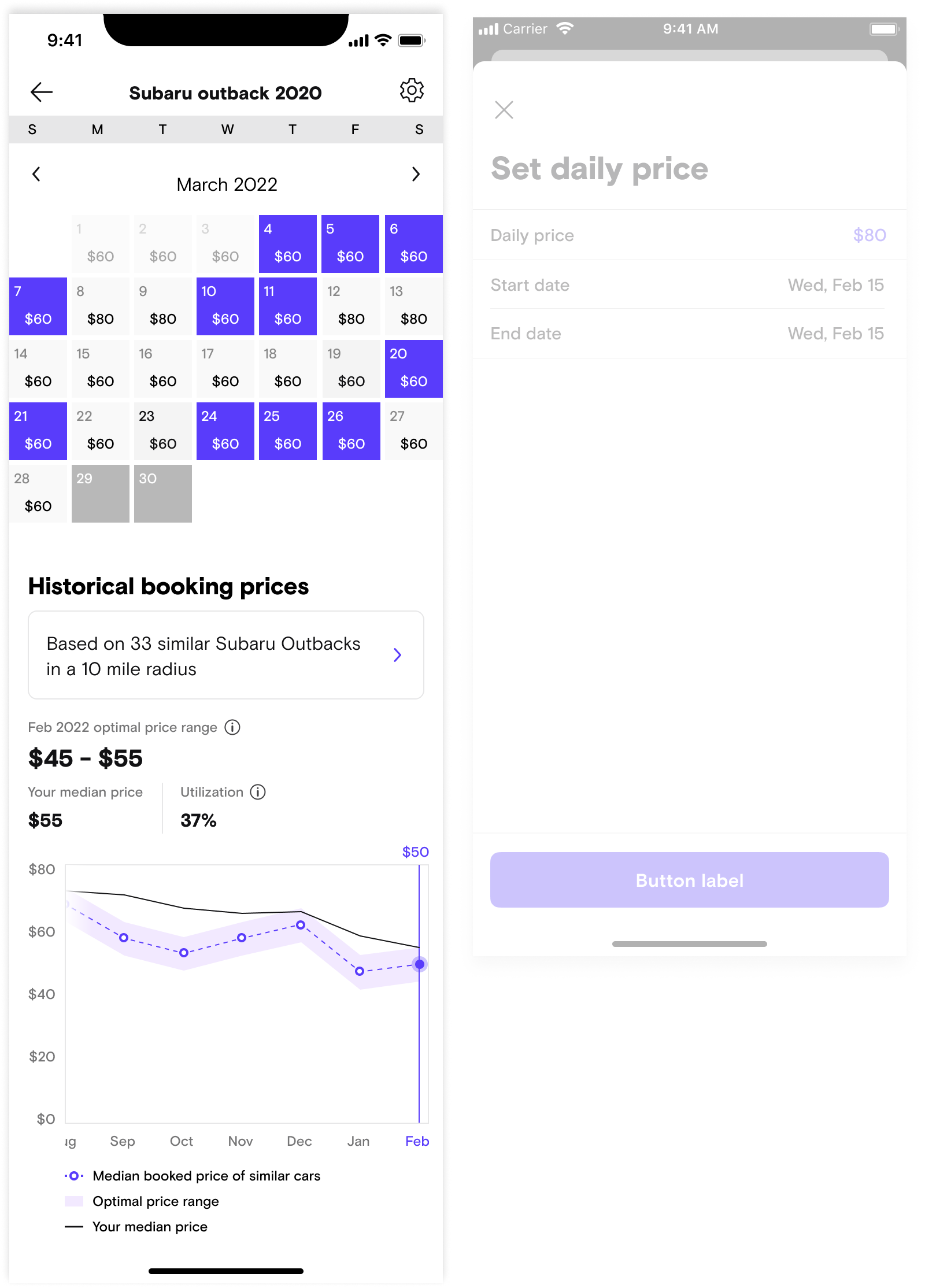
After synthesizing results and discussing our future plans for the pricing settings, we decided to keep the insights on their own separate page and explore ways to make the entry point more accessible and obvious. Qin lead the final visual design explorations of the entry point and after additional testing, settled on a bottom sheet pattern.


Consider finding a way to better separate concepts between optimal price range (market data) and the host’s data to reduce confusion.
Consider displaying data for both weekends and weekdays
My visual recommendations
Consider using a dotted line for future/predictive data (not in v1)
Consider using a solid for historical data.
Consider removing the range, since it didn’t seem to help hosts understand what to set prices at.
Consider swapping info icon for question icon (to stay consistent with the rest of the product)
Consider adding explanation to each label
Consider adding “your” to utilization label to make it more clear that this section references the host’s data.
Converging on the final design
Qin continued to iterate based off the research, my recommendations, and additional input from our stakeholders.

Entrypoint changes
Sticky bottom was updated to a more flexible bottom sheet
Link was updated to an insight

Chart changes
Added weekends and weekdays data
Displayed volume data is based off of
Added concept of High/medium/low utilization
Measuring success
We shipped the trending insights in July 2022 and launched a feedback survey so that we could continue to measure host sentiment.
Our hosts loved it too
“Also pat on the back to everyone involved getting the first analytics feature live! It’s amazing”
- Howard M., Power host in Miami
“This is insane! Before I got into Turo I had to do days worth of research with, like, 25 tabs open just trying to figure out what's best to grow. This is going to save so much time! Turo is really paying attention to what hosts like me need..."
- Mustafa M., Power host
We received great feedback from our sales team
“[I] Just had an amazing coaching call with an account that has been IMPOSSIBLE to get to lower his prices. We went through the call with the pricing insights tool up and I could hear the lightbulb go off and the smile on his face. He is also excited that he could see what vehicles he wants to add that are similar to his by looking at the high utilization vehicles in Similar Models.
This is a total game changer team. Thank you. The amount of trust this builds through transparency cannot be overstated. My job just got so much more powerful!"
- Will West, Power host account manager 2022
There is more to be done
Increasing trust takes time. It is only through consistency of providing good data to our hosts and continuing to add personalization that we can truly gain their trust.
I am proud of the work we did and excited for future versions.